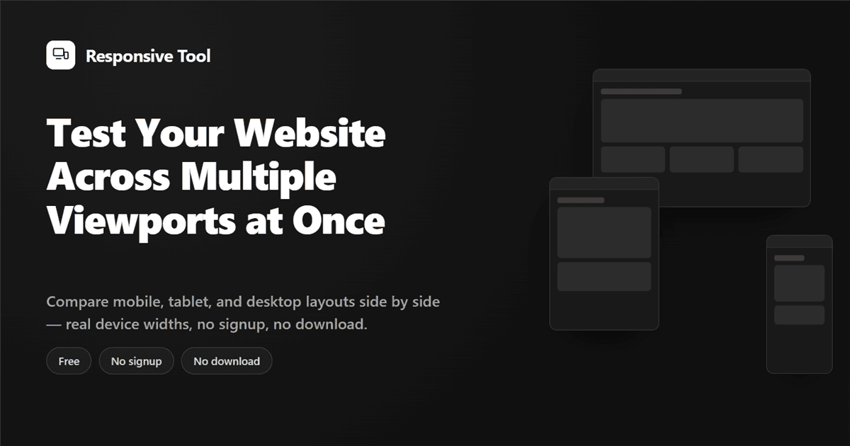
Responsive Tool is a free responsive website checker — test your website on mobile, tablet, and desktop at once, no signup, no download.
Responsive Tool What's My Viewport CSS Breakpoints Device Sizes Blog Support on Ko-fi Responsive Website Checker for Mobile, Tablet & Desktop Responsive Tool is a free responsive checker that lets you test your website on mobile, tablet, and desktop viewports at the same time — swap any pane's device instantly, test custom widths, no signup, no download. How it works No setup required. 1 Paste your URL Drop in your site's link and hit Preview — no signup, no install. 2 Swap any device Each pane renders the real CSS viewport for that device. Swap it instantly, or enter a cust
Responsive Tool is a free responsive website checker — test your website on mobile, tablet, and desktop at once, no signup, no download.
Responsive Tool What's My Viewport CSS Breakpoints Device Sizes Blog Support on Ko-fi Responsive Website Checker for Mobile, Tablet & Desktop Responsive Tool is a free responsive checker that lets you test your website on mobile, tablet, and desktop viewports at the same time — swap any pane's device instantly, test custom widths, no signup, no download. How it works No setup required. 1 Paste your URL Drop in your site's link and hit Preview — no signup, no install. 2 Swap any device Each pane renders the real CSS viewport for that device. Swap it instantly, or enter a cust